#Iconbutton Flutter
Explore tagged Tumblr posts
Visit Tumblr Blog
Explore Tumblr blogs with no restrictions, modern design and the best experience.
Last Seen Tumblr Blogs


Fun Fact
Total funding amounts to $125.3M.
Text
A Comprehensive Guide of Flutter AppBar Widget

The AppBar widget is an essential component in Flutter for creating a top-level navigation bar in your application. It provides a consistent and customizable way to display the toolbar, leading icon, title, and actions at the top of the screen. In this blog post, we will explore the various features and usage of the Flutter AppBar widget.
What is the AppBar widget?
The AppBar widget is based on Material Design principles and is part of the Flutter material library. It serves as the primary navigation component for your application and is typically placed at the top of the screen. The AppBar can contain other widgets within its layout, making it versatile for different use cases.
Key Features of the AppBar widget
Toolbar: The AppBar displays the toolbar widgets, including the leading icon, title, and actions. The toolbar provides a space for important controls and information.
Leading Icon: The leading icon is typically an icon or widget placed at the start of the AppBar. It can be used for navigation or to indicate the current screen or context.
Title: The title is a text or widget that represents the current screen or application. It is usually centered within the AppBar.
Actions: Actions are a set of widgets placed at the end of the AppBar. They can be used for additional functionality, such as search, settings, or user profile.
FlexibleSpace: The AppBar can have a flexible space that allows for more customization. This space can contain widgets like images, gradients, or animations.
Usage of the AppBar widget
To use the AppBar widget in your Flutter application, follow these steps:
Import the material library:
import 'package:flutter/material.dart';
Create a Scaffold widget as the root of your application:
void main() {
runApp(MyApp());
}
class MyApp extends StatelessWidget {
@override
Widget build(BuildContext context) {
return MaterialApp(
home: Scaffold(
appBar: <link>AppBar</link>(
title: Text('My App'),
),
body: Container(
// Your app content goes here
),
),
);
}
}
Customize the AppBar as per your requirements:
appBar: <link>AppBar</link>(
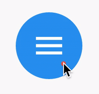
leading: IconButton(
icon: Icon(Icons.menu),
onPressed: () {
// Handle leading icon press
},
),
title: Text('My App'),
actions: [
IconButton(
icon: Icon(Icons.search),
onPressed: () {
// Handle search action
},
),
IconButton(
icon: Icon(Icons.settings),
onPressed: () {
// Handle settings action
},
),
],
),
Add additional widgets and functionality to your application as needed.
Conclusion
The Flutter AppBar widget is a powerful tool for creating a top-level navigation bar in your application. It provides a consistent and customizable way to display important controls and information. By understanding its features and usage, you can create stunning and user-friendly app bars in your Flutter projects.
I hope this blog post helps you in understanding the Flutter AppBar widget better. Happy coding!
Remember to replace the code snippets with your own implementation and customize the AppBar according to your application's needs.
0 notes
Text
Icon Button Flutter

GFButtons are clickable buttons that are used widely in an application. GFButtons come in many shapes and types. One of them is the icon button flutter. For more details, visit https://docs.getwidget.dev/gf-button/icon-button/
0 notes
Text
Hola Mundo con Flutter Dart y VSCode
Hola Mundo con Flutter Dart y VSCode aparece primero en nuestro https://jonathanmelgoza.com/blog/hola-mundo-con-flutter-dart-y-vscode/
Hoy vamos a ver como hacer nuestra primera app del tipo hola mundo con Flutter, esta tecnología para crear aplicaciones móviles para android e iOS programando solo una vez y que además nos permite hacerlo con un lenguaje algo nuevo pero bastante sencillo, Dart.
Flutter es una tecnología increíble desarrollada por Google.
Nos permite programar aplicaciones móviles y generarlas con el mismo código central para android, iOS e incluso web.
Existen varias opciones similares para esto, pero la verdad es que el hecho que Google este detrás y la facilidad del lenguaje de programación utilizado es para llamar la atención.
El lenguaje utilizado es Dart y la verdad es que es bastante sencillo de utilizar, sobre todo si vienes de desarrollo web y conoces de objetos o clases.
En Flutter todo es un widget, que es lo mismo que una clase, solo personalizas con parámetros de estos mismos objetos.
Para entrar en materia vamos a hacer el clásico hola mundo con Flutter, Dart y VSCode.
youtube
Para este tutorial debemos tener instalado Flutter y utilizaremos el editor de código VSCode.
Iniciamos creando nuestro proyecto Flutter mediante el gestor de paquetes presionando en VSCode Ctrl + Shift + P y eligiendo crear una nueva aplicación Flutter.
Una vez generado el demo vamos a eliminar todo el contenido de main.dart y escribimos el siguiente:
import 'package:flutter/material.dart'; import 'package:holamundo/home.dart'; void main() runApp(MyApp()); class MyApp extends StatelessWidget const MyApp(Key? key) : super(key: key); @override Widget build(BuildContext context) return MaterialApp( debugShowCheckedModeBanner: false, title: "Hola Mundo", home: HolaMundoHome() );
Ahora creamos un nuevo archivo de código en lib llamado home.dart y escribimos el siguiente código:
import 'package:flutter/material.dart'; class HolaMundoHome extends StatelessWidget @override Widget build(BuildContext context) return Scaffold( appBar: AppBar( leading: IconButton( icon: Icon(Icons.menu), tooltip: "Menu principal", onPressed: () => print("Haciendo clic..") , ), title: Text('Titulo principal'), actions: <Widget>[ IconButton( icon: Icon(Icons.search), tooltip: "Buscar", onPressed: () => print('buscando..') ) ], ), body: Center( child: Text('¡Hola mundo!'), ) );
Con este tendremos nuestra primera aplicación Flutter terminada y luce así.
Si este hola mundo con Flutter te ha sido de utilidad no olvides compartirlo en tus redes sociales favoritas y dejarnos un comentario en la sección de abajo si tienes cualquier duda relacionada con este tema, será un placer ayudarte.
¡Hasta luego!
1 note
·
View note
Text
Complete Flutter and Dart Roadmap 2020
Mohammad Ali Shuvo
Oct 30, 2020·4 min read
DART ROADMAP
Basics
Arrays, Maps
Classes
Play On Dart Compiler
String Interpolation
VARIABLES
var
dynamic
int
String
double
bool
runes
symbols
FINAL AND CONST
differences
const value and const variable
NUMBERS
hex
exponent
parse methods
num methods
math library
STRINGS
methods
interpolation
multi-line string
raw string
LISTS
List (Fixed and Growable)
methods
MAPS
Map (Fixed and Growable)
methods
SETS
Set ((Fixed and Growable)
methods
FUNCTIONS
Function as a variabl
optional and required parameters
fat arrow
named parameters
@required keyword
positional parameters
default parameter values
Function as first-class objects
Anonymous functions
lexical scopes
Lexical closures
OPERATORS
unary postfix expr++ expr — () [] . ?.
unary prefix -expr !expr ~expr ++expr — expr await expr
multiplicative * / % ~/
additive + -
shift << >> >>>
bitwise AND &
bitwise XOR ^
bitwise OR |
relational and type test >= > <= < as is is!
equality == !=
logical AND &&
logical OR ||
if null ??
conditional expr1 ? expr2 : expr3
cascade ..
assignment = *= /= += -= &= ^= etc.
CONTROL FLOW STATEMENTS
if and else
for loops
while and do-while
break and continue
switch and case
assert
EXCEPTIONS (ALL ARE UNCHECKED)
Throw
Catch
on
rethrow
finally
CLASSES
Class members
Constructors
Getting object type
instance variables
getters and setters
Named constructors
Initializer lists
Constant constructors
Redirecting constructors
Factory constructors
instance methods
abstract methods
abstract classes
Inheritance
Overriding
Overriding operators
noSuchMethod()
Extension methods
Enums
Mixins (on keyword in mixins)
Static keyword, static variables and methods
GENERICS
Restricting the parameterized type
Using generic methods
LIBRARIES AND VISIBILITY
import
as
show
hide
deferred
ASYNCHRONY SUPPORT
Futures
await
async
Streams
Stream methods
OTHER TOPICS
Generators
Callable classes
Isolates
Typedefs
Metadata
Custom annotation
Comments, Single-line comments, Multi-line comments, Documentation comments
OTHER KEYWORDS FUNCTIONS
covariant
export
external
part
sync
yield
FLUTTER ROADMAP
Flutter Installation (First App)
Flutter Installation
Basic Structure
Android Directory Structure
iOS Directory Structure
BASICS
MaterialApp
Scaffold
AppBar
Container
Icon
Image
PlaceHolder
RaisedButton
Text
RichText
STATELESS AND STATEFULWIDGETS
Differences
When To Use?
How To Use?
Add Some Functionality
INPUT
Form
Form Field
Text Field
TextEditing Controller
Focus Node
LAYOUTS
Align
Aspect Ratio
Baseline
Center
Constrained Box
Container
Expanded
Fitted Box
FractionallySizedBox
Intrinsic Height
Intrinsic Width
Limited Box
Overflow Box
Padding
Sized Box
SizedOverflowBox
Transform
Column
Flow
Grid View
Indexed Stack
Layout Builder
List Body
List View
Row
Stack
Table
Wrap
Safe Area
MATERIAL COMPONENTS
App bar
Bottom Navigation Bar
Drawer
Material App
Scaffold
SliverAppBar
TabBar
TabBarView
WidgetsApp
NAVIGATOR
pop
Routes
Bottom Navigation
Drawer
Create Multipage App
popUntil
canPop
push
pushNamed
popAndPushNamed
replace
pushAndRemoveUntil
NavigatorObserver
MaterialRouteBuilder
BUTTONS
ButtonBar
DropdownButton
FlatButton
FloatingActionButton
IconButton
OutlineButton
PopupMenuButton
RaisedButton
INPUT AND SELECTIONS
Checkbox
Date & Time Pickers
Radio
Slider
Switch
DIALOGS, ALERTS, AND PANELS
AlertDialog
BottomSheet
ExpansionPanel
SimpleDialog
SnackBar
INFORMATION DISPLAYS
Card
Chip
CircularProgressIndicator
DataTable
LinearProgressIndicator
Tooltip
LAYOUT
Divider
ListTile
Stepper
SCROLLING
CustomScrollView
NestedScrollView
NotificationListener
PageView
RefreshIndicator
ScrollConfiguration
Scrollable
Scrollbar
SingleChildScrollView
Theory …
Flutter -Inside View
Dart
Skia Engine
Performance
Comparison
App Built In Flutter
OTHER USEFUL WIDGETS
MediaQuery
LayoutBuilder
OrientationBuilder
FutureBuilder
StreamBuilder
DraggableScrollableSheet
Learn How to Use Third Party Plugins
CUPERTINO (IOS-STYLE) WIDGETS
CupertinoActionSheet
CupertinoActivityIndicator
CupertinoAlertDialog
CupertinoButton
CupertinoContextMenu
CupertinoDatePicker
CupertinoDialog
CupertinoDialogAction
CupertinoNavigationBar
CupertinoPageScaffold
CupertinoPicker
CupertinoPageTransition
CupertinoScrollbar
CupertinoSegmentedControl
CupertinoSlider
CupertinoSlidingSegmentedControl
CupertinoSwitch
CupertinoTabBar
CupertinoTabScaffold
CupertinoTabView
CupertinoTextField
CupertinoTimerPicker
ANIMATIONS
Ticker
Animation
AnimationController
Tween animation
Physics-based animation
AnimatedWidget
AnimatedBuilder
AnimatedContainer
AnimatedOpacity
AnimatedSize
FadeTransition
Hero
RotationTransition
ScaleTransition
SizeTransition
SlideTransition
NETWORKING
http, dio libraries
json parsing
Local Persistent Storage
SQFLITE
Shared Preferences
Hive
JSON
JSON- PARSING
INTERNATIONALI ZING FLUTTER APPS
Locale
AppLocalization
json files
STATE MANAGEMENT
setState
InheritedWidget
ScopedModel
Provider
Redux
BLOC
OTHER IMPORTANT TOPICS
Widget Tree, Element Tree and Render Tree
App Lifecycle
Dynamic Theming
Flare
Overlay widget
Visibility Widget
Spacer Widget
Universal error
Search Layout
CustomPainter
WidgetsBindingObserver
RouteObserver
SystemChrome
Internet connectivity
Http Interceptor
Google Map
Firebase Auth
Cloud FireStore DB
Real time DB
File/Image Upload
Firebase database
Firestore
Semantic versioning
Finding size and position of widget using RenderObject
Building release APK
Publishing APK on Play Store
RxDart
USEFUL TOOLS
Dev Tools
Observatory
Git and GitHub
Basics
Add ,Commit
Push
Pull
Github,Gitlab And Bitbucket
Learn How to Become UI Pro
Recreate Apps
Animations
Dribble -App Ui
Make Custom Widgets
Native Components
Native Share
Permissions
Local Storage
Bluetooth
WIFI
IR Sensor
API -REST/GRAPH
Consume API
Basics of Web Dev
Server
TESTING AND DEBUGGING
Debugging
Unit Testing
UI (Widget) Testing
Integration Testing
WRITING CUSTOM PLATFORM-SPECIFIC CODE
Platform Channel
Conclusion: There are some courses out there but I believe self-learning is the best. However, you can take help whenever you feel like it. Continue Your Journey By making Apps and also You can clone the existing apps for learning the concept more clearly like Ecommerce , Instagram , Expense Manager , Messenger ,bla bla …….
Most important thing to remember that don’t depend on others too much , when you face any problem just google it and a large flutter community is always with you.
Best of luck for your Flutter journey
Get Ready and Go………..
1 note
·
View note
Text
Commonly Used Widgets in Flutter: A Guide to Text, Image, Container, Button, and More

Flutter provides a wide range of pre-built widgets that simplify the process of building beautiful and interactive user interfaces. In this blog post, we will explore some of the commonly used widgets in Flutter and understand their usage and functionality.

Text Widget
The Text widget allows you to display text on the screen. It supports various styling options, such as font size, color, alignment, and more.
Image Widget
The Image widget is used to display images in your Flutter app. You can load images from local assets or network URLs.
Container Widget
The Container widget is a versatile widget that provides layout and styling capabilities. It can be used to specify dimensions, padding, margin, background color, and more.
Button Widgets
Flutter provides multiple button widgets for handling user interactions. Some commonly used button widgets include: ElevatedButton The ElevatedButton widget creates a material-design-style raised button. TextButton The TextButton widget creates a text-based button. IconButton The IconButton widget creates an icon-based button.
ListTile Widget
The ListTile widget is used to display a row with leading and trailing widgets, typically used in lists or menus.
Card Widget
The Card widget is used to create a material-design-style card with a shadow and rounded corners.
TextField Widget
The TextField widget provides a text input field where users can enter text.
Other Commonly Used Widgets
Here are a few more commonly used widgets in Flutter: AppBar The AppBar widget represents the top app bar in your application. It typically contains a title, actions, and navigation buttons. Scaffold The Scaffold widget provides a basic structure for your app, including an app bar, body, and other essential UI elements. SingleChildScrollView The SingleChildScrollView widget allows you to create a scrollable view for content that exceeds the screen's height.
Conclusion
Understanding and utilizing commonly used widgets in Flutter is essential for building engaging and interactive user interfaces. The Text, Image, Container, Button, ListTile, Card, TextField, and other mentioned widgets offer a solid foundation for creating dynamic and visually appealing Flutter applications. Experiment with these widgets, explore their properties and capabilities, and combine them creatively to craft stunning user interfaces in your Flutter projects. Happy widget-building! Read the full article
0 notes
Text
How to Change AppBar Color in Flutter – A Beginner’s Tutorial

The AppBar is the most noticeable widget for users, and its background color is based on the colors specified in ThemeData. The Flutter AppBar widget is also widely utilized in numerous applications by Flutter developers. It contains a search field, page navigation buttons, or the page title. But, Flutter provides a specialized widget for this purpose, as it is frequently used.
AppBar is a built-in widget in Flutter that provides a top-level structure for the app. It typically contains the toolbar and other standard action buttons, such as a back button. It is highly customizable but can be replaced with other widgets, such as a scrollable AppBar, to provide a more flexible structure.
Alternatively, custom app bars can be created from scratch by these programmers. When you open the new page of the project you just created, you might notice that the color of the back button differs from what you had configured for the theme colors of your app.
AppBar In Flutter: An Overview
The AppBar is a toolbar placed at the top of your app. It’s a necessary component that can be found in almost all applications. It typically contains items like a leading, title, and actions. The AppBar is a widget, allowing it to incorporate other widgets.
For example, an AppBar with a log-out button is embedded inside. Flutter AppBar is an interactive element that adheres to Material Design standards. It is typically located at the top of the screen and can incorporate other widgets in its design.
How to Create AppBar In Flutter?
In Flutter, AppBar is part of Scaffold. The Scaffold is a widget that contains your application. It contains different widgets(parts), but the main ones are the AppBar, body, bottom navigation bar, and the floating button. We can say that the Scaffold is the container of the AppBar.
The AppBar widget can contain various toolbar widgets such as menu, action, and icon buttons. Here is the process of creating the AppBar widget:
Step 1: Generate a New Flutter Application:
To begin your project, open a terminal window and type the below command to create the project. After creating it, please navigate to the project folder and open it with your preferred text editor/IDE.
flutter create flutter_appbar_tutorialStep 2: Clear The Automated Generated Coding In Flutter App:
When working on a new project with Flutter, it is recommended to start by cleaning the main file in lib/main.dart. It involves removing all comments, deleting the counter button and associated code, and removing the title parameter of MyHomePage. Still, the goal is to have the code as simple as possible. Thus, Flutter generates a code that has a basic AppBar, only displaying text.
Step 3: Customization Scope In Appbar:
In this step, we will personalize the AppBar by changing its primary characteristics. Recall that Flutter functions using widgets, which can contain other widgets. The AppBar widget has three primary properties:
The leading which can take a widget,
The title can take a widget, and
The actions can take a list of widgets.
We will investigate this in more detail in the subsequent step!
Step 4: Generate AppBar Activity In Flutter
Our goal in this step is to recreate the increment button, as seen in the auto-generated code. In order to accomplish this purpose, it is necessary to make a variable in _MyHomePageState and write two functions to adjust the state variable, one to increase its value and one to decrease it.
int _counter = 0; // Add 1 to the `_counter` void _incrementCounter() { setState(() { _counter++; }); } // Remove 1 to the `_counter` void _decrementCounter() { setState(() { _counter--; }); }
Once the logic has been set up, we can focus on the application’s design. We can update the leading to display an icon of our choice and update the title text and the body to show the counter value as text. Then, we can add two buttons to the actions list using the IconButton widget. The first button will increment the counter’s value, and the second will decrease it.
return Scaffold( appBar: AppBar( // Update the `leading` to have a better design leading: Icon(Icons.accessibility), // Change the app name title: Text("Flutter Calculator"), actions: <widget>[Text("First action")]), body: Center( // Update the body with a Text widget // to display the counter value child: Text( '$_counter', style: TextStyle(fontSize: 50.0), ), ), );</widget>
Finally, we can pass the two functions we created before as parameters of our onPressed properties.
actions: <widget>[ // First button - decrement IconButton( icon: Icon(Icons.remove), // The "-" icon onPressed: _decrementCounter, // The `_decrementCounter` function ), // Second button - increment IconButton( icon: Icon(Icons.add), // The "+" icon onPressed: _incrementCounter, // The `_incrementCounter` function ), //IconButton ],</widget>
Output
Change AppBar Color on Page Level In Flutter
You can alter the color of the app bar in Flutter by setting the backgroundColor property with the desired color. It will let you customize the styling of the AppBar. Let us explore the stepwise process to change the AppBar color, which Flutter developers use:
Step 1: Find the AppBar widget, usually located in your project directory’s lib/widgets folder.
Step 2: In the AppBar widget, use the backgroundColor argument to specify the desired background color. E.g., backgroundColor: Colors.deepPurpleAccent.
Step 3: To use the app, open it on your device and follow the instructions on the screen.
AppBar( centerTitle: true, title: Text('Hii'), backgroundColor: Colors.deepPurpleAccent, ),
Converting the Global AppBar Color
To have a consistent appearance across all the pages of your application, you can set the AppBar color at the app level. To do this, you can use the AppBarTheme widget and assign a specific color to the color parameter. This way, the color of the app bar will be the same for all the pages in the app.
Step 1: Find the MaterialApp widget at the Flutter app’s root.
Step 2: Add the ThemeData class as the theme parameter inside the MaterialApp widget.
Step 3: Add the appBarTheme parameter inside the ThemeData class and assign the AppBarTheme class to it.
Step 4: In the AppBarTheme, include a color property and assign a desired color.
MaterialApp( title: 'Flutter Demo', theme: ThemeData( primarySwatch: Colors.blue, appBarTheme: AppBarTheme( iconTheme: IconThemeData(color: Colors.black), color: Colors.deepPurpleAccent, //<-- SEE HERE), ), home: ChangeAppBarColorDemo(),);
Method To Add Color In AppBar In Flutter
There are three primary methods for adding color to the AppBar widget: a predefined color, a custom color, and a theme color.
Color(0xffF02E65): This is achieved by creating a custom color.
Colors.Red: To specify a particular color from a limited range of available colors.
Color. From RGB (255, 66, 125, 145): This uses the RGB (red, green, and blue) color model to create a range of colors by combining different levels of the primary colors.
Example: (change color using theme)
import 'package:flutter/material.dart';const Color darkBlue = Color.fromARGB(255, 18, 32, 47);void main() { runApp(MyApp());}class MyApp extends StatelessWidget { @override Widget build(BuildContext context) { return MaterialApp( theme: ThemeData( primarySwatch: Colors.blue, appBarTheme:const AppBarTheme( iconTheme: IconThemeData(color: Colors.black), color: Colors.deepPurpleAccent, ), ), debugShowCheckedModeBanner: false, home:Scaffold( appBar:AppBar(title : const Text("Appbar Example")), body : const Center( child :Text( "Welcome"),), ), ); }}
Example : (Change color using background color)
import 'package:flutter/material.dart';const Color darkBlue = Color.fromARGB(255, 18, 32, 47);void main() { runApp(MyApp());}class MyApp extends StatelessWidget { @override Widget build(BuildContext context) { return MaterialApp( debugShowCheckedModeBanner: false, home:Scaffold( appBar:AppBar(title : const Text("Appbar Example"), backgroundColor: Colors.red,), body : const Center( child :Text( "Welcome"),), ), ); }}
Output :
Conclusion
The AppBar is a frequently used component in many different applications by Flutter developers. It is beneficial for incorporating search fields, navigating between pages, or displaying the page title. Flutter has a particular widget that makes using an AppBar easier – the AppBar widget.
In this article, we explored the various ways to change the color of an AppBar in Flutter, such as at the page level or app level, and discussed the many different methods for adding colors.
Frequently Asked Questions (FAQs)
1. How do I change colors in the Flutter app?
Step 1: Find the file where you must put the Text widget.
Step 2: Inside the Text widget, add a style parameter and assign the TextStyle widget.
Step 3: Include a color parameter inside the TextStyle widget and set your favorite color.
2. How do I change the color of an AppBar drawer in Flutter?
Add the icon theme property inside the AppBar widget and assign IconThemeData to alter a drawer icon in Flutter.
3. What are the various types of Appbars available in Flutter?
AppBar’s layout comprised three elements: leading, title, and actions. However, the leading is placed in the leftmost position in AppBar, and the title and actions are in the right corner.
Originally Published At: https://flutteragency.com/change-appbar-color-in-flutter/
0 notes
Photo
Day 40 of 100DaysOfCode Flutter Edition
TIL about the IconButton class, which is a material design icon button.
An icon button is a picture printed on a Material widget that reacts to touches by filling with color (ink).
0 notes
Text
【 Flutter 】Flutter を 基礎 から 学習 ( Material ComponentsとiOS-Style ) part134 Material Components
【 Flutter 】Flutter を 基礎 から 学習 ( Material ComponentsとiOS-Style ) part134 Material Components
「 基礎 から 学ぶ Flutter 」という書籍で 学習 したことを ブログでアウトプットしていこうと思います。今回は Material ComponentsとiOS-Style ( part134 )です。 前回 【 Flutter 】Flutter を 基礎 から 学習 ( Material ComponentsとiOS-Style ) part133 Material Components 引き続き、Material Componentsについて学びます。 IconButton IconButtonはその名の通りタップ可能なアイコンです。 import 'package:flutter/material.dart'; void main() { runApp(new MaterialApp(home: new MyHomePage())); } class…

View On WordPress
0 notes
Text
Flutter: For loop inside widget
Today I have learnt how to use for loops inside widget which supports children parameter.
syntax for that is:-
for(loop parameters)
widget,
Example:
Row( children: [ for (int i = 0; i < widget.bnIcons.length; i++) Expanded( child: Column( children: [ IconButton( icon: Icon( widget.bnIcons[i], size: 40, color: Colors.white, ), onPressed: widget.bnfunc[i], ), Text( widget.bnTitle[i], textAlign: TextAlign.center, style: TextStyle( color: Colors.white, ), ), ], ), ), ], ),
widget.bnTitle, widget.bnfunc and widgets.bnIcons are the variable which are list which is previously declared.
0 notes
Photo

Flutter ちょっと Tips 〜画面の上にポップアップを表示する〜 https://ift.tt/2ri2fpQ
画面の上にポップアップ的なものを表示したい
画面の下に表示したいのなら、ボトムシートがあるのでそれでいいと思います。
BottomSheet class https://api.flutter.dev/flutter/material/BottomSheet-class.html
そうではなく、この手のものを「上に出したい!」という時にどうしたらいいかという話です。 検索しても意外と見つからなかったので、作りました。 (Material Design 的に上に出すってどうなの?という話はあるかと思いますが)
[2019/06/11 追記] Material Design に「Banner」というものがあるのを教えていただきました。 https://material.io/design/components/banners.htmlhtml 下の GIF やコードもそれに準拠するよう変更しました
↓こういう、上部に何かのメッセージを出して、Closeボタンを押したら消えるというヤツです。
考え方
だいぶ泥臭い作り方してます。 Scaffold の Body 部分を
Stack → メイン表示部分(今回は Center(RaisedButton) だけ) → POP部分 (Container) → IconButton(Close ボタン)
という形にして、
POP部分を表示するかどうか決める変数 _isTapClose を作る(初期値 false)
POP部分は _isTapClose が false なら IconButton を含む内容、true なら Container() (空の Container)とする
IconButton を押されたら _isTapClose を true にし、setState して StatefulWidget を再描画させる
(必要に応じて)メイン表示部分はPOPの height 分だけ上方向に Margin を持たせる。_isTapClose が true になったら Margin の値を 0 にする。こうすることで、POP が消えたことによってメイン表示部分が上に移動する(ように見える)
こういう処理になるように StatefulWidget を作っただけです。
コード
import 'package:flutter/material.dart'; void main() => runApp(MyApp()); class MyApp extends StatelessWidget { // This widget is the root of your application. @override Widget build(BuildContext context) { return MaterialApp( title: 'Flutter Demo', theme: ThemeData( primarySwatch: Colors.blue, ), home: MyHomePage(title: 'Flutter Demo Home Page'), ); } } class MyHomePage extends StatefulWidget { MyHomePage({Key key, this.title}) : super(key: key); final String title; @override _MyHomePageState createState() => _MyHomePageState(); } class _MyHomePageState extends State<MyHomePage> { bool _isTapClose = false; void _onTapCloseButton() { setState(() { _isTapClose = true; }); } @override Widget build(BuildContext context) { return Scaffold( appBar: AppBar( title: Text(widget.title), ), body: Stack( children: <Widget>[ Container( margin: EdgeInsets.only(top: (_isTapClose ? 0.0 : 50.0)), color: Colors.yellow, child: getList()), (_isTapClose ? Container() : UpperPop()), ], )); } Widget UpperPop() { final TextStyle textStyle = TextStyle(fontSize: 20); final TextStyle textButtonStyle = TextStyle(fontSize: 20, color: Colors.blue); final Size displaySize = MediaQuery.of(context).size; return Container( height: (50), width: displaySize.width, child: Row( children: <Widget>[ Expanded(child: Text('Upper Pop Test', style: textStyle)), FlatButton( onPressed: () { _onTapCloseButton(); }, child: Text( "Close", style: textButtonStyle, ), ), ], )); } Widget getList() { return ListView(children: <Widget>[ Text('Item'), ]); } }
ここからの発展
あとは、POP部分やメイン部分に好きな Widget を配置すればいいでしょう。 Stack に乗せているのはなぜかというと、メイン表示部分がリストのようにスクロールする場合に、POP部分が一緒にスクロールされないように(画面上に固定されているように)するためです。 アニメーションを使ってPOP部分が上にニュッと消えるようにするのもカンタンにできそう。
元記事はこちら
「Flutter ちょっと Tips 〜画面の上にポップアップを表示する〜」
November 06, 2019 at 02:00PM
0 notes
Text
Introduction to Material Design 3 in Flutter
When Material Design 3 introduces there are a few changes to code levels you have to make to reflect in the UI.
In this article, we will learn how to use Material 3 in the Flutter project with the new material design that Google is developing. As we all know, Flutter 3.3 is out now and supports the latest Material 3 design by Google.
ThemeData
As part of the migration to Material Design 3, a new useMaterial3 flag to ThemeData will allow applications to opt-in to Material Design 3 changes that are coming to many of the components across the library.
No components are currently affected, but as we transfer each component to Material Design 3, they will use this flag to determine which defaults they should use.
class MyApp extends StatelessWidget { const MyApp({Key? key}) : super(key: key); // This widget is the source of your application. @override Widget build(BuildContext context) { return MaterialApp( title: 'Flutter Sample', theme: ThemeData( useMaterial3: true, primarySwatch: Colors.blue, ), home: const MyHomePage(title: 'Flutter Sample Home Page'), ); } }
Components
The following Flutter components have been updated to Material Design 3 colors, text styles and shapes generated from the Material Design 3 token database:
Buttons
The common buttons (ElevatedButton, TextButton, and OutlineButton) need to be modified to the most recent design specification as part of the transition to Material Design 3.
Color: Dynamic color compatibility and new color mappings. Now, labels and icons have the same hue.
Icons: 18dp is the new standard size for leading and trailing icons.
Shape: New minimum width, greater height, and fully rounded corner radius
Typeface: The button text is in sentence case; there are no ALL CAPS.
Types: The term “contained button” has been replaced by the terms “elevated button,” “filled button,” and “filled tonal button.”
Example Of Elevated Button
Elevated Button ElevatedButton( child: const Text('Enabled Button'), onPressed: () { debugPrint("Elevated button clicked") }, )
Example Of Outlined Button
OutlinedButton( onPressed: () { debugPrint('Received click'); }, child: const Text('Outlined Button'), )
Example Of Text Button
Text Button TextButton( style: ButtonStyle( foregroundColor: MaterialStateProperty.resolveWith<Color?>( (Set<MaterialState> states) { if (states.contains(MaterialState.selected)) { return Colors.white; } return null; // defer to the defaults }, ), backgroundColor: MaterialStateProperty.resolveWith<Color?>( (Set<MaterialState> states) { if (states.contains(MaterialState.selected)) { return Colors.indigo; } return null; // defer to the defaults }, ), ), onPressed: () { // TODO: handle Text Button }, child: const Text('Text Button'), )
FloatingActionButton
On a screen, the FAB symbolizes the most significant activity. It makes important acts possible.
The floating action buttons in Flutter come in three sizes: FAB, small FAB, and large FAB.
Example Of Floating Action Button
FloatingActionButton( onPressed: () { // Add your onPressed code here! }, child: const Icon(Icons.add), )
Small Floating Action Button
FloatingActionButton.small( onPressed: () { // Add your onPressed code here! }, child: const Icon(Icons.add), )
Large Floating Action Button
FloatingActionButton.extended( onPressed: () { // Add your onPressed code here! }, label: const Text('Add'), icon: const Icon(Icons.add), )
IconButton
As part of the Material Design 3 specification there are updates to the Icon button’s visuals as optional support for toggle states, as well:
The updated IconButton will appear like the common buttons(TextButton, OutlinedButton etc) without text.
Example Of Filled Icon Button
IconButton( icon: const Icon(Icons.filter_drama), onPressed: onPressed, style: IconButton.styleFrom( foregroundColor: colors.onPrimary, backgroundColor: colors.primary, disabledBackgroundColor: colors.onSurface.withOpacity(0.12), hoverColor: colors.onPrimary.withOpacity(0.08), focusColor: colors.onPrimary.withOpacity(0.12), highlightColor: colors.onPrimary.withOpacity(0.12), ))
Example Of Filled Tonal Icon Button
Filled Tonal Icon Button IconButton( icon: const Icon(Icons.filter_drama), onPressed: onPressed, style: IconButton.styleFrom( foregroundColor: colors.onSecondaryContainer, backgroundColor: colors.secondaryContainer, disabledBackgroundColor: colors.onSurface.withOpacity(0.12), hoverColor: colors.onSecondaryContainer.withOpacity(0.08), focusColor: colors.onSecondaryContainer.withOpacity(0.12), highlightColor: colors.onSecondaryContainer.withOpacity(0.12), ), )
Example Of Outlined Icon Button
Outlined Icon Button IconButton( icon: const Icon(Icons.filter_drama), onPressed: onPressed, style: IconButton.styleFrom( focusColor: colors.onSurfaceVariant.withOpacity(0.12), highlightColor: colors.onSurface.withOpacity(0.12), side: onPressed == null ? BorderSide( color: Theme.of(context) .colorScheme .onSurface .withOpacity(0.12)) : BorderSide(color: colors.outline), ).copyWith( foregroundColor: MaterialStateProperty.resolveWith( (Set states) { if (states.contains(MaterialState.pressed)) { return colors.onSurface; } return null; }), ), )
Card
Card Widget in Flutter come in three different variations: elevated, filled, and outlined.
A card is identifiable as a single, contained unit, can hold anything from images to headlines, supporting text, buttons, lists, and other components.
Color: Compatibility with dynamic color and new color mappings
Elevation: Lower elevation by default, with no shadow
Three different forms of official cards: raised, filled, and outlined
Example Of Elevated Card
Card( child: SizedBox( width: 300, height: 100, child: Center(child: Text('Elevated Card')), ), )
Example Of Filled Card
Filled Card Card( elevation: 0, color: Theme.of(context).colorScheme.surfaceVariant, child: const SizedBox( width: 300, height: 100, child: Center(child: Text('Filled Card')), ), )
Example Of Outlined Card
Card( elevation: 0, shape: RoundedRectangleBorder( side: BorderSide( color: Theme.of(context).colorScheme.outline, ), borderRadius: const BorderRadius.all(Radius.circular(12)), ), child: const SizedBox( width: 300, height: 100, child: Center(child: Text('Outlined Card')), ), )
Chips
In contrast to buttons, which are persistent, chips indicate possibilities in a given environment.
Four different chip types exist: assist, filter, input, and suggestion
Color: Compatibility with dynamic color and new color mappings
Shape: Rectangle with corners
Types: Assist chips and suggestion chips are two different categories of action chips. Currently, a subset of choice chips are filter chips.
Chip( avatar: const CircleAvatar(child: Text('FA')), label: const Text('Flutter Agency'), onDeleted: () { // TODO: handle delete action }, )
Dialog
Dialogs can convey information, demand a response, or guide users through a process. Basic and full-screen dialogues are the two different varieties.
Color: Compatibility with dynamic color and new color mappings.
Layout: Greater padding utilized for increased corner-radius and title size
Position: Option for custom basic dialog positioning.
Shape: Increased corner-radius
Typography: Larger and darker headline
Example
OutlinedButton( onPressed: () { Navigator.of(context).restorablePush(_dialogBuilder); }, child: const Text('Open Dialog'), ) static Route _dialogBuilder( BuildContext context, Object? arguments) { return DialogRoute( context: context, builder: (BuildContext context) { return AlertDialog( title: const Text('Basic dialog title'), content: const Text( 'A dialog is a kind of modal window that\n' 'views in front of app content to\n' 'provide critical information, or prompt\n' 'for a decision to be made.'), actions: [ TextButton( style: TextButton.styleFrom( textStyle: Theme.of(context).textTheme.labelLarge, ), child: const Text('Disable'), onPressed: () { Navigator.of(context).pop(); }, ), TextButton( style: TextButton.styleFrom( textStyle: Theme.of(context).textTheme.labelLarge, ), child: const Text('Enable'), onPressed: () { Navigator.of(context).pop(); }, ), ], ); }, ); }
Also, Read This Post:
AppBar
Color: Color: Compatibility with dynamic color and new color mappings
Elevation: A color fill rather than a drop shadow establishes separation from the content.
Typography: Larger default text
Layout: Larger default height
Types: There are currently four sizes for top app bars: small, medium, and large.
Example
Scaffold( appBar: AppBar( actions: [ TextButton( style: style, onPressed: () {}, child: const Text('Action 1'), ), TextButton( style: style, onPressed: () {}, child: const Text('Action 2'), ), ], ), ); MaterialApp( theme: ThemeData( useMaterial3: true, colorSchemeSeed: const Color(0xff6750A4) ), home: Material( child: CustomScrollView( slivers: [ SliverAppBar.large( leading: IconButton(icon: Icon(Icons.menu), onPressed: () {}), title: const Text('Large App Bar'), actions: [ IconButton(icon: const Icon(Icons.more_vert), onPressed: () {}), ], ), // Just some content much enough to have unique object to scroll. SliverToBoxAdapter( child: Card( child: SizedBox( height: 1200, child: Padding( padding: const EdgeInsets.fromLTRB(8, 100, 8, 100), child: Text( 'Here be scrolling content...', style: Theme.of(context).textTheme.headlineSmall, ), ), ), ), ), ], ), ), )
Also, Read This Post:
Color
ColorScheme
Comes with an updated/expanded color scheme to grant more flexibility.
There are two deprecated colors for ColorScheme: primaryVariant and secondaryVariant. They need to be removed from the 5 constructors and the copyWith method. I then map references of these properties to primaryContainer and secondaryContainer.
As part of the migration to Material Design 3, this PR adds new APIs to make it easy to generate new Material Design 3 ColorSchemes from just a single color.
The new APIs are as follows:
ColorScheme.fromSeed()
You can construct a complete Material Design 3 ColorScheme derived from the tones of a single seed color with:
final lightScheme = ColorScheme.fromSeed(seedColor: Colors.green); final darkScheme = ColorScheme.fromSeed(seedColor: Colors.green, brightness: Brightness.dark);
Typography / Iconography
Material Design 3 comes with an updated/expanded typography scale to allow for more flexibility. We will be updating the text theme to support Renaming existing text styles so they are grouped into 5 categories with small, medium, large size and Add a new Typography constructor that provides updated default values for each text style for Material Design 3.
Conclusion
A whole ColorScheme no longer needs to be explicitly created, and the dynamic color is naturally supported on devices; Material Design 3 is a little simpler. You’ll like being able to use actual brand color in the app theme design now that you can. By combining Material 3 with the Flutter application, you can build consistent and unified UI experiences across web, desktop, and mobile platforms.
The Flutter developers have been putting a lot of effort into giving Flutter complete Material 3 functionality. As seen above, you can already move your current Material 2 app to Material 3. You can follow the app development of Flutter widgets that don’t yet have Material 3 support if you use them. Moreover, if you are looking for dedicated developers who can work on your project, you can hire flutter developer for the hourly-based model or fixed projects. We are delighted to help you.
Frequently Asked Questions (FAQs)
1. What is Material Design in Flutter development?
Material design in Flutter is an adaptable design system. Hence, with the help of the Material design system, we can develop the Flutter widgets.
2. How can I access material 3 in the Flutter framework?
To enable Material 3, first, define the theme of ThemeData in the MaterialApp class and will set its useMaterail3 property to true. By using this functionality, you select Use Material 3.
3. Why is the MaterialApp class used in Flutter?
MaterialAppclass is the predefined class and the core component of Flutter. It accesses all the other components and widgets which Flutter SDK gives.
Source: https://flutteragency.com/material-design-3-in-flutter/
0 notes
Text
How to Add Interactivity to Your Flutter App?

Your app’s responsiveness depends on how you adjust it. An app with solely non-interactive widgets will be made interactive in this tutorial. By developing a custom stateful widget, you’ll be able to create an icon tappable by adding two stateless widgets.
Creating a stateful widget
The construct() function and the widget’s mutable state are both located in the state class.
The widget’s state object uses setState() to instruct the framework to redraw the widget whenever the object’s value changes.
Custom stateful widgets may be created in this area. An IconButton Widget and Text will be the two children of a single custom stateful widget that replaces two stateless widgets the solid red star and the numeric count next to it. If the above solutions are difficult for you to implement, get expert advice and solution support from our skilled Flutter engineers. You can also get business application consultation from our experienced development team.
Two classes must be created in order to implement a custom stateful widget
A subclass of State that includes the widget’s state and specifies the construct() function for the widget.
The FavoriteWidget widget for the lakes app is shown in this section. After setting up, the first step is to decide how FavoriteWidget’s state is handled.
Step #1: Prepare for the task at hand
Make sure your surroundings are set up before you begin.
Use Flutter to create a simple “Hello World” app.
Main.dart should replace the lib/main.dart file
It is recommended that you use pubspec.yaml instead of pubspec.yaml.
After connecting a device, or launching an iOS or Android emulator, you’re ready to start!
Step #2: Determine which object is responsible for managing the state of the widget.
There are many other approaches to managing the state of a widget; however, in this example, the widget itself, FavoriteWidget, will handle managing its own state.
Toggling the star is a standalone operation in this demonstration that has no impact on the parent widget or the rest of the user interface; hence, the widget may manage its state on its own internally during Flutter custom app creation.
Step #3: Subclass the StatefulWidget
Because the FavoriteWidget class is responsible for its own state management, it must override the createState() method in order to generate a State object. When the framework needs to construct the widget, it makes a call to the createState() method.
In this demonstration, the createState() function provides a return value that is an instance of the _FavoriteWidgetState class. You will build this class in the subsequent step.
class FavoriteWidget extends StatefulWidget {
const FavoriteWidget({super.key});
@override
_FavoriteWidgetState createState() => _FavoriteWidgetState();
}
Step #4: Specifying the Subclass State
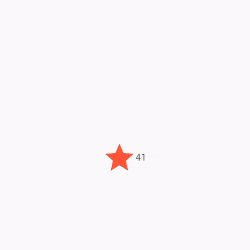
The data that is mutable and subject to change over the lifetime of the widget is stored in the _FavoriteWidgetState class. When the program is initially started up, the user interface shows a solid red star, which indicates that the lake has “favorite” status, coupled with the number 41, which represents the number of likes. The following information is kept in the _isFavorited and _favoriteCount fields:
class _FavoriteWidgetState extends State<favoritewidget> {
bool _isFavorited = true;
int _favoriteCount = 41;
// ···
}</favoritewidget>
In addition, the class specifies a construct() function, which, when called, produces a row with a text box and a button with a red icon. You use IconButton rather than Icon because it contains a onPressed property that specifies the callback method (_toggleFavorite) for handling a tap. This is why you use IconButton rather than Icon.
Following this, you will be tasked with defining the callback function.
class _FavoriteWidgetState extends State<favoritewidget> {
// ···
@override
Widget build(BuildContext context) {
return Row(
mainAxisSize: MainAxisSize.min,
children: [
Container(
padding: const EdgeInsets.all(0),
child: IconButton(
padding: const EdgeInsets.all(0),
alignment: Alignment.centerRight,
icon: (_isFavorited
? const Icon(Icons.star)
: const Icon(Icons.star_border)),
color: Colors.red[500],
onPressed: _toggleFavorite,
),
),
SizedBox(
width: 18,
child: SizedBox(
child: Text(‘$_favoriteCount’),
),
),
],
);
}
}</favoritewidget>
When the IconButton is pushed, the function _toggleFavorite() is called, and inside that method is a call to setState (). It is essential to use setState() because doing so notifies the framework that the state of the widget has changed and that the widget has to be repainted as a result. The following are the states that may be toggled on and off using the function parameter to setState():
A symbol of a star together with the number 41
An symbol with a star border and the number 40
void _toggleFavorite() {
setState(() {
if (_isFavorited) {
_favoriteCount -= 1;
_isFavorited = false;
} else {
_favoriteCount += 1;
_isFavorited = true;
}
});
}
Step #5: Insert the stateful widget into the tree of widgets
In the build() function of your program, add your own unique stateful widget to the tree of other widgets. First, the code that generates the icon and the text has to be located and then deleted.
Example
class FavoriteWidget extends StatefulWidget {
const FavoriteWidget({Key? key}) : super(key: key);
@override
_FavoriteWidgetState createState() => _FavoriteWidgetState();
}
class _FavoriteWidgetState extends State<favoritewidget> {
bool _isFavorited = true;
int _favoriteCount = 41;
@override
Widget build(BuildContext context) {
return Scaffold(
appBar: AppBar(
title: const Text(“Example”),
),
body: Row(
mainAxisAlignment: MainAxisAlignment.center,
crossAxisAlignment: CrossAxisAlignment.center,
children: [
Center(
child: Container(
// color: Colors.green,
padding: const EdgeInsets.all(0),
child: IconButton(
padding: const EdgeInsets.all(0),
alignment: Alignment.centerRight,
icon: (_isFavorited
? const Icon(
Icons.star,
size: 50,
)
: const Icon(
Icons.star_border,
size: 50,
)),
color: Colors.red[500],
onPressed: _toggleFavorite,
),
),
),
SizedBox(
width: 18,
child: SizedBox(
child: Text(‘$_favoriteCount’),
),
),
],
),
);
}
void _toggleFavorite() {
setState(() {
if (_isFavorited) {
_favoriteCount -= 1;
_isFavorited = false;
} else {
_favoriteCount += 1;
_isFavorited = true;
}
});
}
}</favoritewidget>
Output
Conclusion
So, we have been through the complete step-by-step guide to add interactivity to the Flutter application. However, adding interactivity to the app is imperative as it is integral to Flutter application development. We have learned to create a custom stateful widget and how we can utilize that to add interactivity to the flutter application.
0 notes
Text
How To Disable Button While Developing An App In Flutter?

Flutter is one of the popular open source UI toolkits with a portable nature and is crafted to build the most dynamic applications, both for mobile and web application. The best thing about Flutter is that it uses a single codebase for Android and iOS application creation. Flutter is free and open-source and is used by developers worldwide and uses the Dart Language.
Buttons play a vital role in the development of any app. It is the most important UI element that an app has. The button on the app allows the users to perform actions when tapped on it. However, sometimes, a need may arise where the button has to be disabled. This article will help you understand the simple way you can disable a button in the Flutter app. We recommend hiring a flutter team to get flawless services.
Steps to Disable a Button
For example, there is a form that helps to send the data to the back end. When a user clicks on the submit button on the app and you do not do anything, and yet you have the submit button still enabled, there are chances that the user will re-click on the button. Hence, it is necessary to block the user when the action is performed. This can only be possible by disabling the button.
When you disable the button for the user, you block the user from performing any action until the last action is completed. You can also consult Flutter developers to solve such issues and to make hassle-free app development process for enterprise level software, and you can rest assured that you will get the best services.
If you wish to disable a button in a flutter, all you need to do is assign the Null value to the compressed side of the button. You need to follow certain steps if you want to disable a button while developing an app on flutter. The Steps are:
Step 1
Add the button you want to disable on your page.
Step 2
Inside the selected button, you must assign the Null value to the onPressed side.
Step 3
After you are done with these, all you need to do is, run the app.
Code Example:
IconButton(
onPressed: null, //<– SEE HERE
child: const Text(
‘Submit’,
style: TextStyle(fontSize: 24),
),
),
You can disable various buttons like the ElavatedButton, IconButton, OutlinedButton, TextButton, FloatingActionButton, etc.
Code Example:
Column(
children: [
TextField(
controller: myController,
decoration: InputDecoration(labelText: ‘Enter Name’),
),
const ElevatedButton(
onPressed: null,
child: Text(
‘Submit’,
style: TextStyle(fontSize: 24),
),
),
const TextButton(
onPressed: null,
child: Text(
‘Submit’,
style: TextStyle(fontSize: 24),
),
),
const OutlinedButton(
onPressed: null,
child: Text(
‘Submit’,
style: TextStyle(fontSize: 24),
),
),
const FloatingActionButton(
onPressed: null,
child: Text(
‘OK’,
style: TextStyle(fontSize: 24),
),
),
const IconButton(
onPressed: null,
icon: Icon(
Icons.done,
),
)
],
)
Disabling a Button if the TextField is Empty
We have seen the basic method of disabling a button while developing an app in a flutter. Now we will see how to disable or enable these buttons programmatically. This part of the article will tell you how to disable a button if the user on the other end has not entered a text in the TextField or has removed a text from the TextField. There are certain steps that one needs to follow for this. The steps are:
Step 1
You will have to add a variable to determine whether to disable or enable a button.
bool submit = false;
Step 2
Listen to the changes made in the TextField using a .addlistener(). However, if there is no text in the TextField, then it is a must for you to add a variable and then rebuild the widget tree.
final myController = TextEditingController();
//———-
@override
void initState() {
// TODO: implement initState
super.initState();
myController.addListener(() {
setState(() {
submit = myController.text.isNotEmpty;
});
});
}
//———–
TextField(
controller: myController,
decoration: InputDecoration(labelText: ‘Enter Name’),
),
Step 3
You need to check the variable that you have put inside the compressed parameter of the button, and according to that, return the function or Null to take action.
ElevatedButton(
onPressed: submit ? () => submitData : null, //<– SEE HERE
child: Text(
‘Submit’,
style: TextStyle(fontSize: 24),
),
),
Full Code Example:
import ‘package:flutter/foundation.dart’;
import ‘package:flutter/material.dart’;
class DisableButtonDemo extends StatefulWidget {
const DisableButtonDemo({Key? key}) : super(key: key);
@override
State<DisableButtonDemo> createState() => _DisableButtonDemoState();
}
class _DisableButtonDemoState extends State<DisableButtonDemo> {
final myController = TextEditingController();
bool submit = false;
@override
void initState() {
// TODO: implement initState
super.initState();
myController.addListener(() {
setState(() {
submit = myController.text.isNotEmpty;
});
});
}
@override
void dispose() {
// Clean up the controller when the widget is disposed.
myController.dispose();
super.dispose();
}
@override
Widget build(BuildContext context) {
return GestureDetector(
onTap: () {
FocusManager.instance.primaryFocus?.unfocus();
},
child: Scaffold(
appBar: …,
body: Column(
children: [
TextField(
controller: myController,
decoration: InputDecoration(labelText: ‘Enter Name’),
),
ElevatedButton(
onPressed: submit ? () => submitData : null,
child: Text(
‘Submit’,
style: TextStyle(fontSize: 24),
),
),
],
),
),
);
}
}
submitData() {
// Do something here
}
Conclusion
Disabling a button while developing an app on flutter is important since by disabling a button, you get to control the user’s actions. In this article, we have walked you through the steps you require to take if you want to disable a button on flutter with a few practical examples. You can also use these techniques to disable other buttons in the flutter.
To make the process of building an app on flutter, you can also choose to hire a flutter team from Flutter Agency. The team of experts will help you craft your choice’s application in the best possible way. We hope this article will help you. See you in our next post!
0 notes
Text
How to Resize an Icon / Icon Button In Flutter?

Icon Widget is the primary way of introducing Icons in Flutter. and IconButton Widget acts just like a button, but with an icon instead of a usual button. so in this article, we will discuss how to resize an Icon / Icon Button in Flutter?
Let’s get started with the same.
How to Resize an Icon / Icon Button In Flutter?
You can use size property for Icon. Code Snippet will look like the below:
You can use size property for Icon.
Icon( Icons.radio_button_checked, size: 12, ),
And for IconButton you can use
Transform.scale( scale: 0.5, child: IconButton( onPressed: (){}, icon: new Image.asset("images/IG.png"), ), ),
IconButton( onPressed: () {}, icon: const Icon(Icons.account_box), iconSize: 50, ),
You can also try the below way:
new SizedBox( height: /*calculate from width and no:of child*/, width: /*calculate from width and no:of child*/, child: new IconButton( padding: new EdgeInsets.all(0.0), icon: new Image.asset("images/IG.png"), onPressed: null, ) )
Below code set width & height for the IconButton and make it to the center of your Container Widget.
Container( height: 18.0, width: 18.0, color: Colors.yellow, child: new IconButton( padding: new EdgeInsets.all(0.0), color: Colors.red, icon: new Icon(Icons.clear, size: 18.0), onPressed: null, ) )
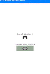
Example:
return Scaffold( appBar: AppBar( title: const Text("Icon Size Example"), ), body: Column( mainAxisAlignment: MainAxisAlignment.center, children: [ const Text("Small size Icon"), const Icon( Icons.home_filled, size: 40, ), const SizedBox( height: 40, ), const Text("This is Icon Button"), Center( child: Container( color: Colors.grey, width: 100, height: 50, child: IconButton( onPressed: () { Fluttertoast.showToast( msg: "Icon Button Clicked", ); }, icon: const Icon(Icons.change_circle_outlined), iconSize: 35, ), ), ), ], ), );
We will get output like the below:
Output:
Conclusion:
Thanks for Reading !!!
Kindly drop your suggestion/feedback to serve you much better.
Do you want to convert your idea to reality? We would love to assist you with the development services.
FlutterAgency.com is our portal Platform dedicated to Flutter Technology and Flutter Developers. The portal is full of cool resources from Flutter like Flutter Widget Guide, Flutter Projects, Code libs and etc.
0 notes
Text
How to Remove Extra Padding Around AppBar Leading Icon In Flutter?

AppBar Widget is the main widget in any Flutter app. It sits at the top of the application and mostly controls major action items. So in today’s article, We will learn about How to Remove Extra Padding Around AppBar Leading Icon In Flutter.
How to Remove Extra Padding Around AppBar Leading Icon In Flutter ??
appBar: AppBar( automaticallyImplyLeading: false, // Don't show the leading button title: Row( mainAxisAlignment: MainAxisAlignment.start, crossAxisAlignment: CrossAxisAlignment.center, children: <Widget>[ IconButton( onPressed: () => Navigator.pop(context), icon: Icon(Icons.arrow_back, color: Colors.white), ), // Your widgets here ], ), ),
Where automaticallyImplyLeading: true hides the leading IconButton so you can add your own widgets.
Just add a property called tile spacing,
appBar: AppBar( leading: Icon(Icons.android), titleSpacing: 0, title: Text(widget.title), ),
You can also try the below way:
AppBar( leadingWidth: 8, // <-- Use this centerTitle: false, // <-- and this leading: Icon(Icons.android), title: Text('Title'), )
We will get output like the below:
More customizations:
AppBar( leading: Transform.translate( offset: Offset(-15, 0), child: Icon(Icons.android), ), titleSpacing: -30, centerTitle: false, title: Text("Title"), )
If you don’t want to use any leading widget:
AppBar( title: Text('Title'), centerTitle: false, titleSpacing: 0, )
Just set titleSpacing and automaticallyImplyLeading to remove space like below:
AppBar( titleSpacing: 0, automaticallyImplyLeading: false, )
When you set the leading = null then the extra space of the leading widget will remove.
Conclusion:
Thanks for Reading!!!
In this article, we have learned about How to Remove Extra Padding Around AppBar Leading Icon in Flutter ??
Do you any Flutter requirements for us? Drop us a requirement
flutteragency.com is an online community dedicated to learning Flutter projects, development tips, issue resolution, news & industry updates. Consult our developer to turn your business idea into an amazing application and grow your business.
0 notes